.png)

View Our Amazon
Listing Gallery
Mini cases of our design listings, A+ content and brand
Design & images ⁕ Listing Copy - Bullets & Descriptions ⁕ Listing Images ⁕ A+ Content ⁕ Brand Story ⁕ Storefront ⁕
What you will find in here (tl;dr)
This is a visual gallery of Amazon listing work - including A+ Content, Storefronts and listing imagery - designed to show how content evolves at each stage of a seller’s journey. Some examples are anonymised, but all reflect real decisions, real trade-offs, and real Amazon strategy.
From basic listing clarity to joined-up brand presence, this gallery shows how small improvements stack up over time - and why thoughtful content matters at every stage.
Dive right in! Click the images to take you straight to the mini-case study.
WELCOME
A practical showcase of Amazon listings, A+ Content, and Storefronts, reflecting the different stages sellers go through as their brands grow.
Some of the work shown here comes from live projects. Other examples have been anonymised or carefully recreated, as most sellers understandably want to keep their listings private.
Not everything here is a transformation story. In many cases, it’s about refinement, structure, or visual direction – showing how individual decisions add up over time. The aim of this gallery is simple: to make Amazon work easier to understand by showing real-world examples, not just talking about them.
What Makes This Different?
We’re not just showing polished listings or finished visuals. We’re showing how Amazon content actually comes together in the real world:
-
How listings evolve at different stages of a seller’s journey
-
How copy, images, A+ Content, and Storefronts layer over time
-
Where quick decisions hold things back – and where they genuinely help
-
Why a bit of joined-up thinking at the start saves a lot of frustration later
Each example uses a real or carefully recreated product to demonstrate a different approach - from getting the basics right on a single listing, through to building out a fuller brand presence across Amazon.
Explore the builds


Travel Comfort, Done Properly
A considered example of how Amazon listing images can move from pure compliance to confident, high-impact storytelling – without losing clarity or trust.
What was going on (and what we changed)
This example started with a familiar challenge: a well-designed product, but no clear visual hierarchy to help shoppers quickly understand what it is, how it works, or why it’s different.
The initial focus was on getting the fundamentals right - clean, compliant imagery on a white background to satisfy Amazon’s requirements and clearly show the product and included components.
From there, the listing imagery was expanded to do more of the heavy lifting:
- Introducing lifestyle scenes to show the product in real-world use
- Using feature callouts to explain comfort, materials, and construction
- Adding comparison and detail shots to answer common buyer questions
- Creating visual consistency across the full image set so the listing feels intentional, not pieced together
The result is a progression rather than a transformation - each image building on the last to guide the shopper from recognition to confidence.
Designer’s notes
-
Brand consistency: A restrained, neutral colour palette is used throughout, with warm accent tones to draw attention to key features without overpowering the product.
-
Typography: Clear, legible fonts are used consistently across all graphics to maintain a premium, cohesive feel.
-
Contrast & hierarchy: Text overlays are carefully balanced against background imagery so benefits are easy to scan on mobile without clutter.
-
Image manipulation: Cutaways, overlays, and close-up textures are used selectively to explain materials and construction without exaggeration.
-
Compliance-first approach: Claims are framed visually rather than emotionally, supporting trust and staying aligned with Amazon’s content guidelines.

1

2

3

4

5
6

7

8
Image gallery overview
This set demonstrates a structured approach to listing imagery:
-
Hero product image – Clean, white-background image showing the full product and included items clearly
-
In-use lifestyle image – Real-world context to show ergonomics and comfort during travel
-
Material & quality focus – Close-up detail highlighting memory foam density and construction
-
Luxury & comfort cues – Supporting accessories and materials introduced without over-claiming
-
Portability & travel readiness – Compact storage and ease of packing visualised clearly
-
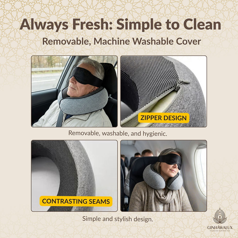
Hygiene & care – Practical reassurance through washable, removable components
-
Comparison & structure – Visual comparison to standard alternatives to clarify positioning
Supporting image – Additional context or reinforcement image to round out the set

Pet Feeding Mat – Product Clarity & Everyday Use
A practical Amazon image set showing how a pet feeding mat helps contain everyday mess, protect floors, and stay in place during meals – using clear, real-world visuals rather than exaggeration.
What we focused on
Setting the scene
This product addresses a very familiar daily issue: food crumbs, water drips, and bowls that slide or splash during feeding time.
The imagery is designed to make that problem immediately recognisable, then show how the mat behaves in real use - not just how it looks in isolation.
Building clarity through the image set
The sequence begins with clean, compliant product imagery to clearly show the mat’s shape, surface pattern, and overall finish.
From there, the visuals expand to do the explanatory work:
- Showing the mat in use with real bowls and pets
- Highlighting how crumbs, splashes, and drips are contained
- Demonstrating absorbency and fast-drying behaviour through close-up detail
- Making stability and floor protection visible with anti-slip and anti-scratch cues
- Providing clear size guidance for different feeding setups
- Confirming suitability for both cats and dogs
Rather than a dramatic before-and-after, the focus is on steady progression - each image answering a common question and reducing uncertainty as the shopper moves through the gallery.
Designer’s notes
-
Brand tone: A warm, pet-friendly visual style is used throughout, balancing practicality with approachability so the product feels suitable for everyday home use rather than overly technical.
-
Colour palette: Neutral greys and soft, earthy accent tones help the mat sit naturally within kitchen and feeding spaces, while allowing functional callouts to stand out clearly.
-
Typography: Rounded, easy-to-read fonts are used consistently across all graphics, reinforcing a friendly tone while remaining legible on smaller screens.
-
Contrast & clarity: Text overlays, icons, and callouts are positioned with mobile viewing in mind, ensuring benefits are easy to scan without cluttering the imagery.
-
Feature-led visuals: Absorbency, fast-drying behaviour, anti-slip backing, and floor protection are shown visually rather than implied, keeping claims grounded and believable.
-
Compliance-aware presentation: Benefits are demonstrated through use and structure rather than emotive language, supporting trust and alignment with Amazon’s content guidelines.

1
2

3

4

5

6

7
Image gallery overview
-
Hero product image – Clean, white-background image clearly showing the mat’s shape, surface pattern, and finish - a bit boring on its own so the supporting imagery needed to be strong to compensate
-
In-use mess containment – Lifestyle image showing bowls in place, with crumbs and drips contained on the mat
-
Material & absorbency detail – Close-up visual explaining the absorbent, porous surface and how small spills are handled
-
Fast-drying behaviour – Visual sequence demonstrating reduced lingering damp patches between refills
-
Stability & floor protection – Anti-slip and anti-scratch features shown through underside and texture details
-
Size & layout guidance – Clear sizing visuals to help shoppers choose the right mat for single or double bowls
-
Pet suitability – Reinforcement image confirming suitability for both cats and dogs

Everyday Carry, Thought Through
A great example of how Amazon listing images can move beyond simple product display to clearly explain security, capacity, and real-world usability – without exaggeration or unnecessary claims.
What was going on (and what we changed)
This example started with a familiar challenge: a well-designed product, but no clear visual hierarchy to help shoppers quickly understand what it is, how it works, or why it’s different.
The initial focus was on getting the fundamentals right - clean, compliant imagery on a white background to satisfy Amazon’s requirements and clearly show the product and included components.
From there, the listing imagery was expanded to do more of the heavy lifting:
- Introducing lifestyle scenes to show the product in real-world use
- Using feature callouts to explain comfort, materials, and construction
- Adding comparison and detail shots to answer common buyer questions
- Creating visual consistency across the full image set so the listing feels intentional, not pieced together
The result is a progression rather than a transformation - each image building on the last to guide the shopper from recognition to confidence.
Designer’s notes
-
Visual hierarchy: Each image has a single, clear purpose – security, storage, material, or carry – to avoid clutter and confusion on mobile.
-
Brand feel: Warm brown tones and restrained graphics support a premium, understated aesthetic appropriate for leather goods.
-
Typography: Clean, legible fonts are used sparingly to support scanning without overpowering the product.
-
Feature-led clarity: Lock mechanism, compartments, and sizing are shown visually rather than implied.
-
Compliance-first approach: Benefits are demonstrated through structure, detail, and use – not emotive or absolute claims.

1

2

3
4

5

6

7

8
Image gallery overview
This image set follows a deliberate, confidence-building progression:
-
Hero product image – Clean white-background shot establishing form, colour, and finish
-
Security feature focus – Close-up visuals explaining the integrated code lock and how it works
-
Internal organisation – Open layout showing compartments, card slots, and zip pocket clearly
-
Capacity & fit guidance – Visual confirmation of phones, tablet size, and everyday essentials
-
Material & craftsmanship – Close-up leather texture and stitching detail to signal quality
-
Carry & usability – Lifestyle imagery showing slim profile, wrist strap, and ease of handling
-
Size & specification clarity – Dimension callouts to remove uncertainty before purchase
-
Gifting & lifestyle reinforcement – Contextual imagery positioning the product as a considered everyday or gift choice
Each image builds on the last, guiding the shopper from recognition to understanding to confidence – without needing to be told what to think.

On gallery below simply hover over the images for the designer's notes.
From Flat Product Shots to Food You Can Almost Taste
From inconsistent, low-confidence imagery to a clear, compliant set that shows performance, quality, and real use.
What was going on (and what we changed)
Before the refresh, the listing relied on a mix of unoptimised product photos and casual snapshots.
The stone itself was fine – but the images weren’t doing it any favours.
The original visuals had a few common problems:
- The main image wasn’t Amazon-compliant and didn’t clearly define the product
- Lifestyle shots felt accidental rather than intentional
- Text-heavy graphics used inconsistent fonts, colours, and proportions
- Phone photos showed wrinkles, marks, and lighting issues that undermined quality
- Packaging looked generic and didn’t reinforce brand value
Together, this made the product feel harder to trust – especially for buyers comparing similar pizza stones side by side.
The updated image set was rebuilt around outcomes, not just objects.
We moved from “here is the stone” to “here is what the stone does”.
Br> Key changes included:
- A clean, compliant hero image that clearly establishes shape, material, and finish
- Performance-led imagery showing bubbling cheese, crisp bases, and high heat in action
- Close-up detail shots that make crust texture and bake quality tangible
- Warm, intentional lifestyle scenes that show family use and shared moments
- A simplified feature infographic using clear icons instead of dense text
- A before-and-after packaging comparison that visibly elevates perceived quality
The result is a listing that feels confident, appetising, and easy to understand – without over-selling or over-explaining.
.jpg)
Before
Unoptimised product image with visible wear, inconsistent lighting, and no brand context – functional, but not confidence-building.
.jpg)
After
Clean, Amazon-compliant hero image with consistent lighting, neutral background, and clear brand presentation that sets quality expectations instantly.

Before
Flat, wide-angle kitchen shot with background distractions and uneven lighting – the product is visible, but the cooking result isn’t the focus.
.jpg)
After
Focused in-oven shot capturing heat, texture, and rise – clearly showing real cooking performance and the quality of the finished pizza.

Before
Text-heavy infographic using mixed fonts, dense copy, and decorative elements that compete for attention and make key benefits harder to scan quickly.
.jpg)
After
Simplified benefits layout with clear icons, consistent typography, and stronger visual hierarchy, making key features easy to understand at a glance.

Before
Plain packaging shot with flat lighting and no product context, giving little sense of quality, use, or what the customer receives.

After
Polished packaging and product shot with improved lighting and context, clearly showing the stone, presentation, and finished result together.

Gentle Whitening, Explained Clearly
A sharp example of how Amazon listing imagery can communicate oral care benefits with clarity and restraint – balancing compliance, trust, and everyday relevance in a sensitive product category.
What was going on (and what we changed)
This listing began with a visually appealing product, but the original imagery leaned heavily on bold claims and dramatic before-and-after messaging.
While eye-catching, this approach risked undermining trust for a category where shoppers are naturally cautious. For oral care products – particularly those positioned as gentle or suitable for sensitive teeth – buyers tend to look for reassurance, routine compatibility, and clear explanations rather than instant transformation.
The goal of the refresh was not to remove benefits, but to reframe how they are shown – shifting from promise-led visuals to explanation-led storytelling.
Building clarity through the image set
The revised image sequence was designed to guide the shopper logically from recognition to confidence.The gallery begins with a clean, compliant hero image that clearly establishes the product, packaging, and key labelling without distraction. From there, each image plays a specific explanatory role:
- Showing realistic surface stain reduction rather than exaggerated whitening effects
- Explaining how the powder fits into a normal brushing routine through step-by-step visuals
- Highlighting gentle, non-abrasive formulation choices through ingredient and texture imagery
- Reinforcing suitability for everyday use with calm, lifestyle-led scenes
- Addressing common concerns around sensitivity, enamel care, and long-term use
- Using restrained comparison graphics to clarify positioning without attacking alternatives
Rather than pushing urgency or speed, the imagery focuses on how the product works and why it feels safe to use regularly.
Designer’s notes
-
Tone & restraint: Claims are presented visually but carefully, avoiding exaggerated language or unrealistic expectations.
-
Colour palette: Cool blues and soft neutrals support a clean, clinical-but-approachable feel appropriate for oral care.
-
Typography: Clear, legible fonts are used consistently to support mobile scanning and accessibility.
-
Hierarchy & spacing: Visual breathing room is prioritised so each message lands clearly without crowding.
-
Compliance awareness: Before-and-after imagery and benefit statements are framed conservatively to align with Amazon guidelines and buyer trust.

1
2

3

4

5

6

7
Image gallery overview
This image set demonstrates a structured, confidence-led approach to personal care listings:
-
Hero product image – Clean white-background image clearly showing the product and packaging
-
Surface stain reduction visual – Carefully framed before-and-after imagery focused on appearance, not medical claims
-
Usage steps – Step-by-step visuals showing how the powder fits into a regular brushing routine
-
Ingredient & formulation focus – Visual explanation of gentle, non-abrasive components
-
Sensitivity reassurance – Messaging and imagery supporting enamel care and daily suitability
-
Lifestyle context – Calm, everyday usage scenes reinforcing routine integration
-
Comparison image – Factual, side-by-side positioning to clarify formulation differences without overstatement
Outcome
The final listing feels calmer, clearer, and more trustworthy.
Instead of relying on dramatic transformation, it builds confidence through explanation – allowing shoppers to understand what the product does, how it works, and whether it fits their needs before making a decision.
This approach is particularly effective in sensitive, health-adjacent categories where credibility and clarity matter more than hype.

Big Play, Clearly Shown
A clear example of how a large inflatable play structure can be presented with confidence and clarity on Amazon – balancing scale, safety, and fun without visual overload.
What was going on (and what we changed)
Scene-setting
From clean product views to energetic lifestyle scenes that help parents quickly understand size, features, and suitability.
What was going on (and how the images were structured)
This listing needed to do one thing well: help parents understand, at a glance, what this inflatable includes, how big it really is, and how it’s used safely in a real garden setting.
Large inflatables can easily feel confusing online if scale, layout, and features aren’t shown clearly. The image set was therefore structured to move from clarity to context in a calm, logical progression.
How the image set works
- The sequence opens with clean, white-background hero imagery to clearly establish the full structure, layout, and colours of the inflatable.
- From there, multiple angles are used to make the dual slides, bounce area, and entry points easy to recognise.
- Close-up detail shots then highlight slide walls, stitching, and material thickness, helping to communicate build quality and durability.
- Lifestyle imagery is introduced to show the inflatable in real garden use, making scale, energy, and age suitability immediately understandable.
- Illustrated callouts are used to label key play features such as the climbing wall, mesh sides, and slides, reducing the need for guesswork.
- Dimensions and weight capacity are presented visually to support quick decision-making for parents.
- Finally, included accessories are shown clearly so buyers know exactly what arrives in the box.
Rather than relying on hype, the imagery answers practical questions step by step – how big it is, what children can do on it, how it’s supervised, and what’s included – helping parents feel confident before purchase.
Designer’s notes
-
Visual clarity first: Large, colourful products are kept readable through clean spacing and consistent framing
-
Parent-focused hierarchy: Size, safety, and supervision cues are prioritised before play features
-
Friendly, playful styling: Bright colours and illustrated accents support a fun tone without clutter
-
Mobile legibility: Callouts and text are sized and positioned for quick scanning on smaller screens
-
Real-world reassurance: Lifestyle images are used to confirm scale, use, and age range rather than exaggerate excitement
-
Compliance-aware presentation: Safety features and capacity are shown visually, not implied through emotive language

1

2
.jpg)
3
4

5

6

7
Image gallery overview
-
Hero product image – Clean, white-background view clearly showing the full inflatable structure
-
Alternate hero angle – Confirms layout, symmetry, and dual-slide design
-
Close-up detail – Slide walls and material construction shown clearly
-
In-use lifestyle image – Children playing outdoors to communicate scale and suitability
-
Feature infographic – Key play elements labelled for quick understanding
-
Safety & benefit focus – Mesh walls, splash area, and supervision cues highlighted
-
Accessories included – Blower, stakes, and repair patches clearly displayed

Men’s Cotton Linen Trousers – Casual Comfort for Daily Wear
A fashion Amazon image set designed to show how these cotton linen trousers look, feel, and behave in real life – from fabric texture and fit through to colour choice and everyday practicality.
What was going on (and what we changed)
Rather than relying on exaggerated claims, the imagery focuses on clarity: what the trousers are, how they sit, and why they work as a comfortable, versatile option for warm-weather, casual dressing.
Before the refresh, the product imagery lacked structure and left key shopper questions unanswered – particularly around fit, fabric feel, and colour selection.
The trousers themselves were well made, but the visuals didn’t fully support buyer confidence when browsing quickly or comparing similar listings.
The updated image set was rebuilt around clarity, comfort, and variation awareness.
We moved from simple product display to a more intentional visual flow that:
- Clearly establishes the trousers’ relaxed silhouette and everyday styling
- Makes fabric texture and lightweight feel visible through close-up detail
- Reduces size and fit uncertainty with clear, worn cont
Designer’s notes
-
Brand tone: Relaxed, modern, and wearable – positioning the trousers as an everyday essential rather than a trend-driven piece
-
Colour palette: Neutral, natural tones that reflect the breathable cotton linen fabric and support easy outfit pairing
-
Typography: Clean, legible type used sparingly to support clarity without distracting from the product
-
Lifestyle balance: Casual lifestyle scenes are used to show real-world wear while maintaining a clean, premium feel
-
Feature visibility: Practical elements such as fit, fabric texture, and drawstring detail are shown visually rather than described
-
Variant clarity: Colour options are presented clearly to reduce confusion and support faster decision-making
1

2
.jpg)
3

4
.jpg)
5
.jpg)
6
.jpg)
7

8

9
.jpg)
10
Image gallery overview
This image set follows a clear, shopper-led progression:
-
Main hero image – Clean, white-background image clearly showing the trousers’ shape, material, and overall finish
-
A/B test main image – Alternative hero composition to support optimisation and testing
-
Casual summer lifestyle – Real-world styling to show relaxed fit and everyday wearability
-
Care & practicality – Visual reassurance around easy care and suitability for regular use
-
Fabric close-up – Detailed texture shot highlighting lightweight cotton linen material and quality
-
Fit & silhouette – On-body image showing straight leg, loose fit, and mid-waist positioning to reduce size doubt
-
Waist & drawstring detail – Close-up feature clarity showing adjustable fit and comfort
-
Lifestyle reinforcement – Additional in-use context supporting versatility and casual styling
-
Close-up detail – Supporting fabric and construction detail to reinforce quality
Colour options (variant clarity) – Clear presentation of available colourways to help shoppers choose confidently
What is this gallery showing?
It’s a collection of real and anonymised Amazon listing design work — including imagery, A+ Content, and Storefront builds.
Can I click through to view the full case studies?
Yes. Each image links to a mini case study with specific design details and strategic notes.
Are these all live Amazon listings?
Some are from live projects, while others have been anonymised or recreated with permission.
Do you offer Amazon listing design as a service?
Yes — we specialise in Amazon listing optimisation, images, A+ Content and storefront design. Visit our Services page to learn more: https://mrsprime.com/services
Can you work with private label or newly launched products?
Absolutely. Whether you’re just launching or refining an existing listing, we tailor designs to your brand’s stage and strategy.